Email & Lifecycle Design

Client:
Longplay
Role:
Designer
Email & Lifecycle Design
Overview
During my time at Longplay, I designed and maintained high-performing lifecycle emails, automated flows, and large campaign systems across multiple brands. The work focused on creating clear, conversion-driven email experiences that supported acquisition, retention, and ongoing customer engagement.

Problem
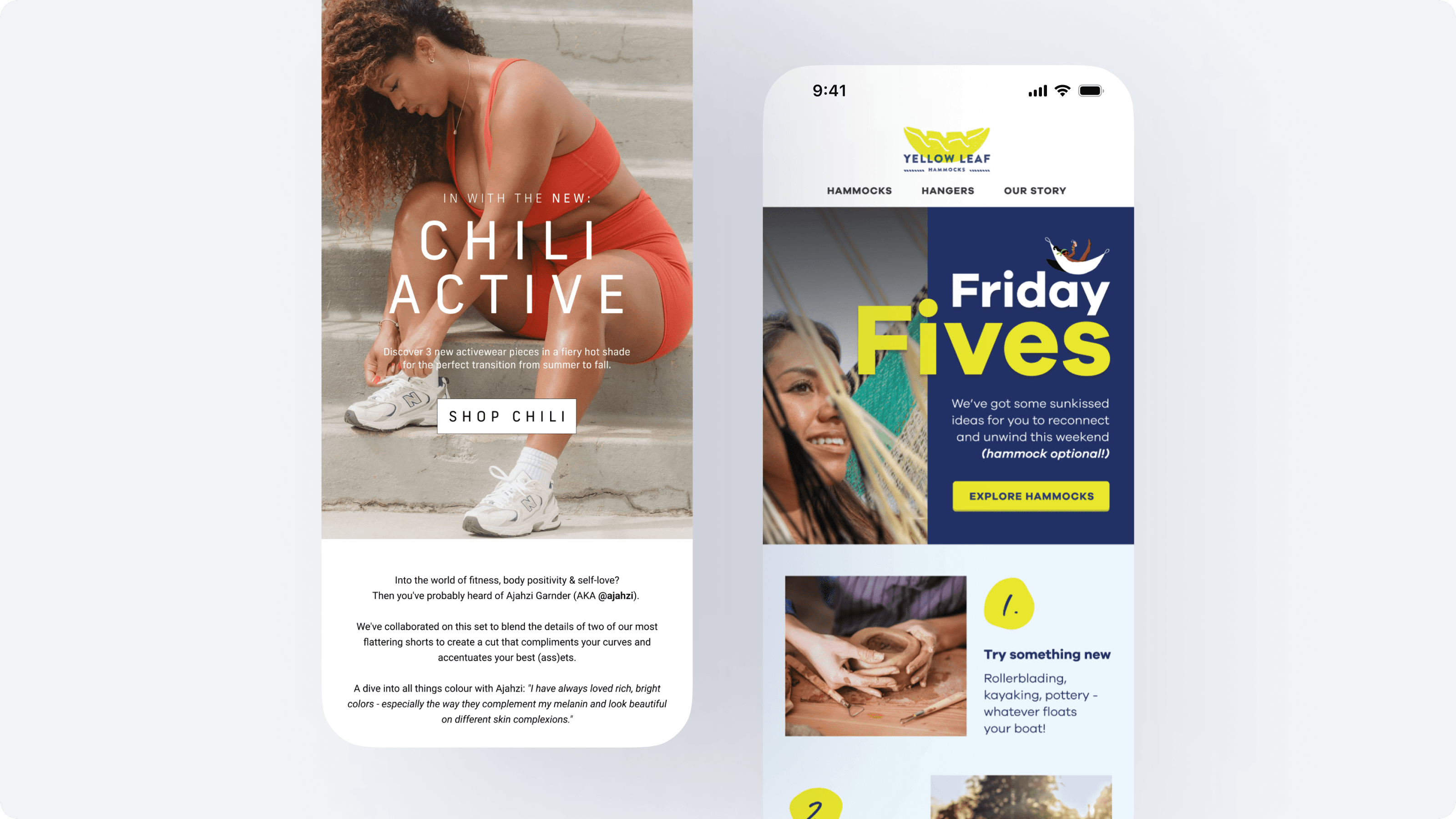
Client email journeys lacked consistency, clear hierarchy, and a cohesive brand voice. Templates were outdated, visual styling varied across flows, and core journeys like welcome and add-to-cart weren’t optimised for conversion. Seasonal campaigns also needed stronger creative direction and a more scalable design system.
Approach
To improve performance and create a repeatable structure, I:
Audited all existing flows to understand gaps, inconsistencies, and performance issues
Established a unified visual system across typography, layout, spacing, and CTA patterns
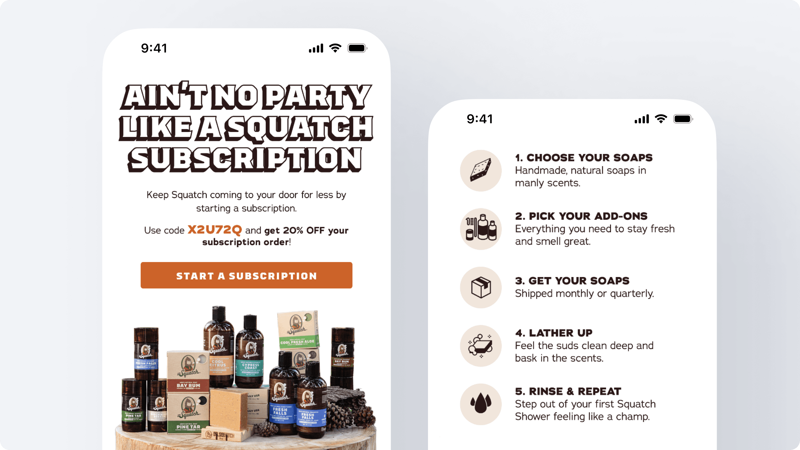
Redesigned core journeys (welcome, add-to-cart, post-purchase, win-back, promotions) with a stronger emphasis on clarity and scannability
Created modular templates that made it easier for teams to build emails quickly without losing quality
Enhanced branding through illustration, photography, and clearer tone of voice
Delivered high-impact creative for major sales events like Black Friday and Cyber Monday
Problem
Client email journeys lacked consistency, clear hierarchy, and a cohesive brand voice. Templates were outdated, visual styling varied across flows, and core journeys like welcome and add-to-cart weren’t optimised for conversion. Seasonal campaigns also needed stronger creative direction and a more scalable design system.
Approach
To improve performance and create a repeatable structure, I:
Audited all existing flows to understand gaps, inconsistencies, and performance issues
Established a unified visual system across typography, layout, spacing, and CTA patterns
Redesigned core journeys (welcome, add-to-cart, post-purchase, win-back, promotions) with a stronger emphasis on clarity and scannability
Created modular templates that made it easier for teams to build emails quickly without losing quality
Enhanced branding through illustration, photography, and clearer tone of voice
Delivered high-impact creative for major sales events like Black Friday and Cyber Monday

Solution
We introduced a cleaner, more cohesive visual language across all touchpoints. Every flow was redesigned for clarity, balance, and stronger persuasion. Templates followed consistent hierarchy rules, CTAs were more prominent, and layouts were optimised for mobile reading patterns.
Automated journeys were restructured with more thoughtful sequencing, improved messaging logic, and visually consistent templates across all stages. Seasonal campaigns received upgraded creative direction with more compelling art direction, improved storytelling, and stronger visual hooks.
Results
Across multiple brands, we delivered:
Higher engagement across core flows (welcome, add-to-cart, and post-purchase)
Clearer visual consistency that strengthened trust and brand perception
Faster production time thanks to a scalable template system
Stronger performance during key sales periods, particularly across BFCM
Positive feedback from marketing teams who could build more quickly with fewer revisions
Conclusion
This work strengthened email as a revenue channel by pairing strong visual design with clear, modular templates and thoughtful customer journeys. The result was a more polished, consistent, and high-performing email ecosystem that supported both day-to-day marketing and long-term customer retention.
