T-Mobile Consumer Paper Bill

Client:
T-Mobile
Role:
Designer
T-Mobile Consumer Paper Bill
Overview
This project involved designing and maintaining T-Mobile’s official paper bill — the legal billing document sent to customers every month. The challenge was to present a very large amount of mandatory information in a clear, structured, and accessible way, while keeping pagination under control for mass printing.

Problem
The previous bill layout suffered from common issues found in legacy paper billing:
Information spread inconsistently across pages
Dense sections that were hard to scan
Page counts increasing unnecessarily
Mandatory legal text competing with customer-friendly clarity
Accessibility issues
Customers struggling to quickly understand their total charges
The bill needed to satisfy legal requirements, work flawlessly as a tagged PDF, and remain easy to read for customers who rely heavily on print.
Approach
I worked closely with billing product owners, solution architects, operations, compliance, and print vendors to understand legal requirements, data constraints, and the technical limitations of PDF generation.
My focus was on:
Establishing strict visual hierarchy
Restructuring content to reduce unnecessary spillover
Ensuring readability at print sizes
Maintaining full accessibility through correct PDF tagging
Creating a stable template that could support many edge cases without breaking
This balance of clarity, compliance, and efficiency shaped the direction of the final design.
Design Thinking
To simplify the billing experience, I first mapped how customers interpret charges, where confusion begins, and what information they expect at each step. This clarity helped me break a traditionally dense, technical flow into intuitive stages: understanding the total, identifying changes, and exploring detailed explanations only when needed.
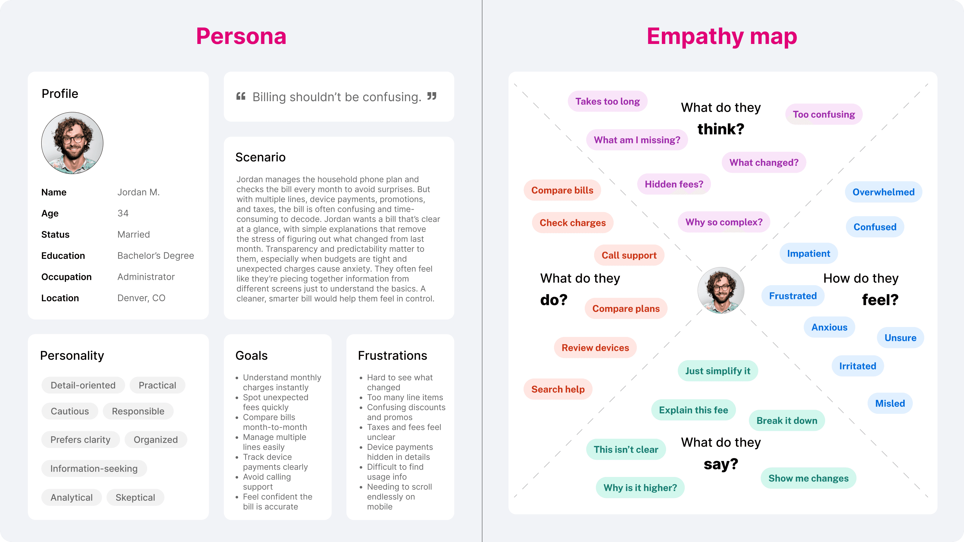
I used these insights to establish a clearer information hierarchy, highlight the root causes of bill changes, and design a consistent pattern for explaining fees, usage, and add-ons. This approach ensured customers could quickly understand what changed and why, without relying on support.
Problem
The previous bill layout suffered from common issues found in legacy paper billing:
Information spread inconsistently across pages
Dense sections that were hard to scan
Page counts increasing unnecessarily
Mandatory legal text competing with customer-friendly clarity
Accessibility issues
Customers struggling to quickly understand their total charges
The bill needed to satisfy legal requirements, work flawlessly as a tagged PDF, and remain easy to read for customers who rely heavily on print.
Approach
I worked closely with billing product owners, solution architects, operations, compliance, and print vendors to understand legal requirements, data constraints, and the technical limitations of PDF generation.
My focus was on:
Establishing strict visual hierarchy
Restructuring content to reduce unnecessary spillover
Ensuring readability at print sizes
Maintaining full accessibility through correct PDF tagging
Creating a stable template that could support many edge cases without breaking
This balance of clarity, compliance, and efficiency shaped the direction of the final design.
Design Thinking
To simplify the billing experience, I first mapped how customers interpret charges, where confusion begins, and what information they expect at each step. This clarity helped me break a traditionally dense, technical flow into intuitive stages: understanding the total, identifying changes, and exploring detailed explanations only when needed.
I used these insights to establish a clearer information hierarchy, highlight the root causes of bill changes, and design a consistent pattern for explaining fees, usage, and add-ons. This approach ensured customers could quickly understand what changed and why, without relying on support.

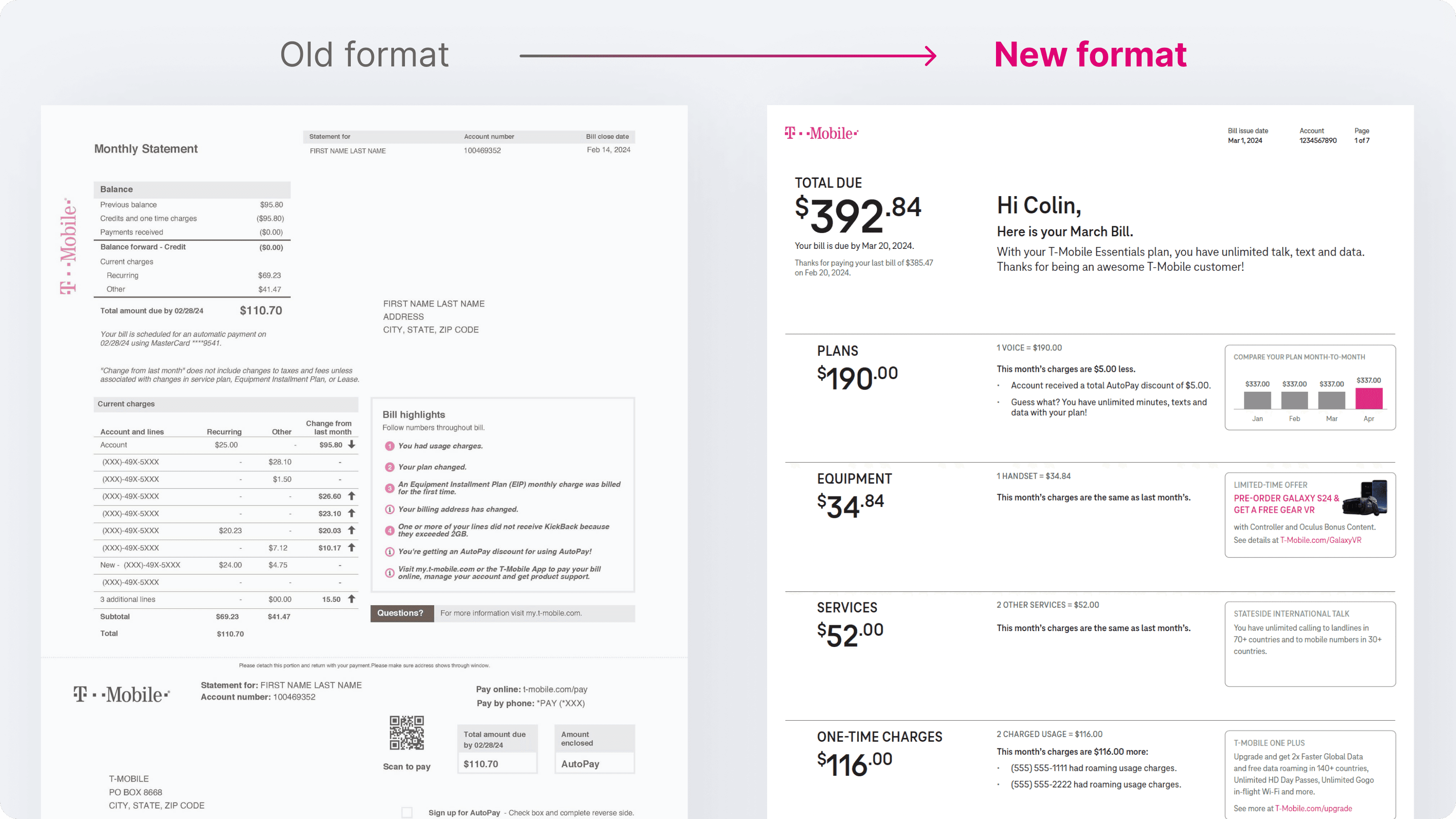
Solution
The redesigned bill was organised into clear, predictable sections:
Summary
Details
Usage
Tax Breakdown
What You Need To Know
Key improvements included:
Stronger hierarchy for totals and due-now amounts
More efficient table structures to prevent overflow
Consistent spacing, typography, and alignment across all pages
Reduced visual noise for cleaner reading
Fully tagged, accessible PDF supporting screen readers
A print-optimised layout that eliminated wasted space without compromising clarity
The result was a legally compliant bill that was significantly easier to understand and cheaper to print at scale.
Results
The improvements delivered measurable impact across clarity, accessibility, and operations:
18% reduction in average page count, lowering print & mail costs
16% decrease in billing-related customer confusion complaints
30% reduction in manual QA issues due to a more stable, consistent structure
100% accessible and screen-reader compatible, meeting compliance standards
Internal billing and operations teams reported improved maintainability and fewer formatting errors
Conclusion
The redesigned paper bill improved clarity, structure and accessibility while reducing operational costs. By presenting information in a logical and consistent way, the bill became easier for customers to understand and simpler for internal teams to maintain.
