T-Mobile Digital Billing Experience

Client:
T-Mobile
Role:
UI/UX Designer
T-Mobile Digital Billing Experience
Overview
As Lead Amdocs Designer for the T-Mobile digital bill experience, my goal was to transform one of the most complex and high-traffic areas of the customer ecosystem into a product that users could actually understand and trust. The redesigned experience serves over 130 million customers, helping reduce billing confusion and customer support calls while improving usability across both mobile and web platforms.

Problem
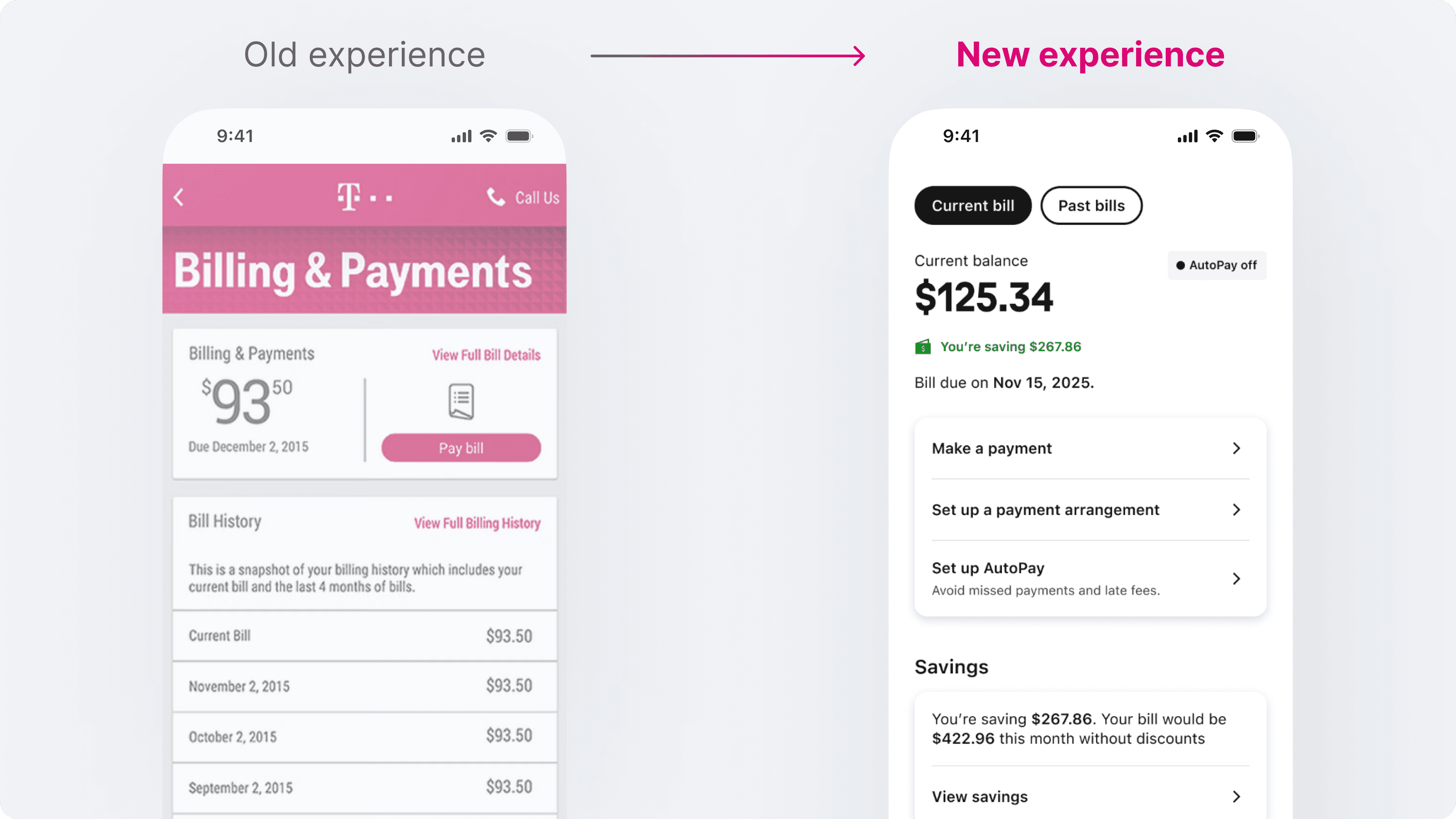
The legacy bill interface was functional but overwhelming.
Customers struggled to identify what they were paying for, why amounts changed month to month, and how discounts were applied. This lack of clarity resulted in high call volumes, low satisfaction, and a growing need for a unified digital billing experience across platforms.
Approach
The body of work was shaped through close collaboration with product owners, business stakeholders, and engineers, guided by data and user feedback at every stage.
Conducted usability reviews and data audits to identify friction points and user pain areas.
Simplified the information hierarchy and introduced progressive disclosure to make details easier to digest.
Designed a modular component system that supports different billing types, devices, and markets.
Worked closely with developers to ensure accessibility, scalability, and performance across web and mobile.
Maintained a continuous feedback loop with analytics and customer care teams to refine and validate design decisions.
Design Thinking
To simplify the billing experience, I first mapped how customers interpret charges, where confusion begins, and what information they expect at each step. This clarity helped me break a traditionally dense, technical flow into intuitive stages: understanding the total, identifying changes, and exploring detailed explanations only when needed.
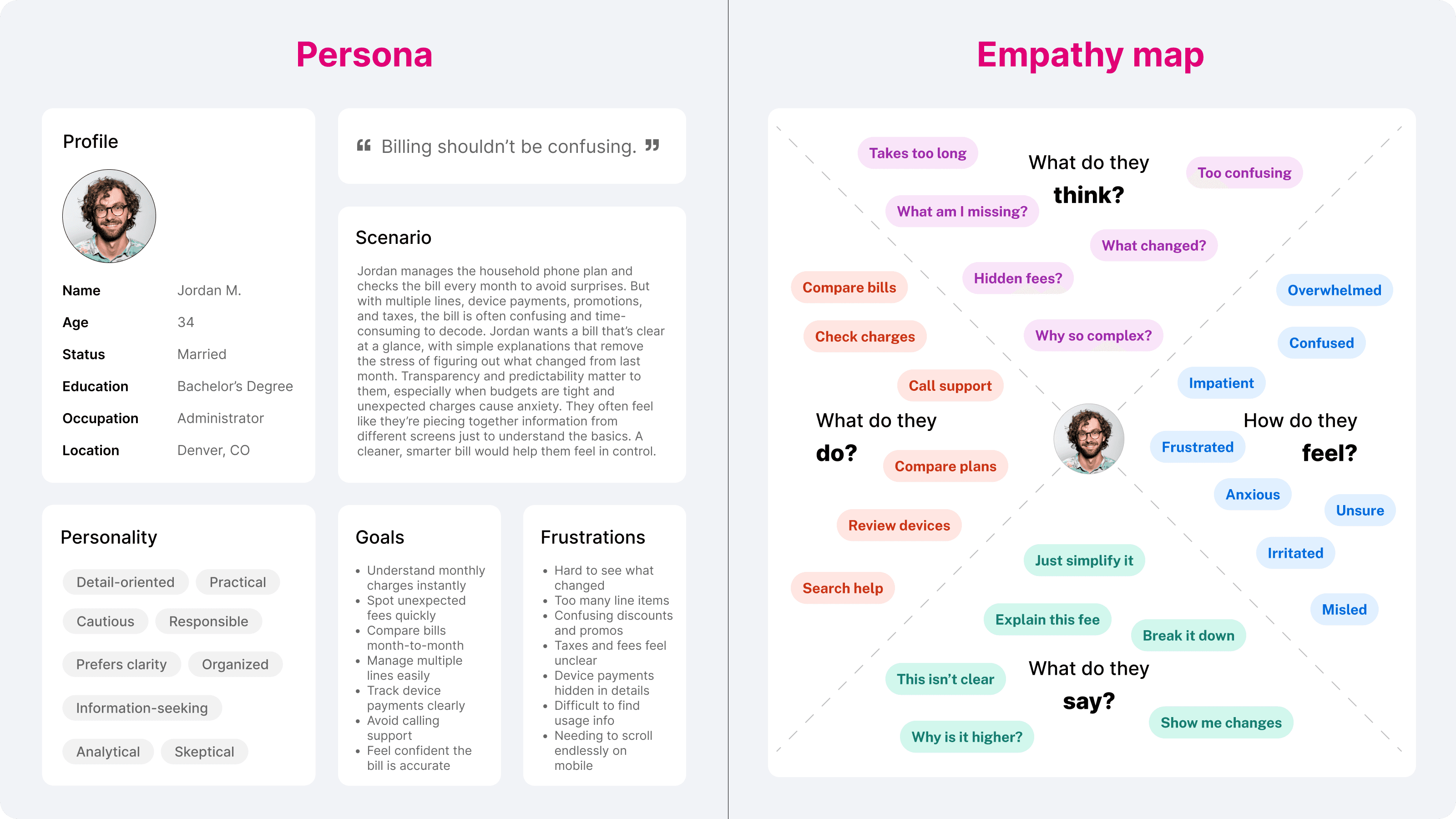
I used these insights to establish a clearer information hierarchy, highlight the root causes of bill changes, and design a consistent pattern for explaining fees, usage, and add-ons. This approach ensured customers could quickly understand what changed and why, without relying on support.
I also mapped the complete billing user flow to see how customers move through key tasks such as viewing charges, comparing bills, managing payments, and reviewing usage.
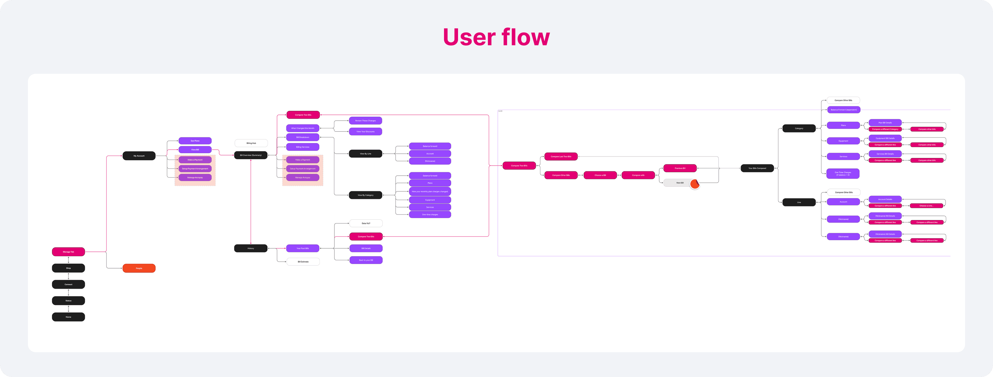
It clarified the full customer journey from start to finish, revealing how people move between tasks and where the design could better support their decision-making.
The result was a predictable, human-centred system that makes complex billing data easier to understand at scale.
Problem
The legacy bill interface was functional but overwhelming.
Customers struggled to identify what they were paying for, why amounts changed month to month, and how discounts were applied. This lack of clarity resulted in high call volumes, low satisfaction, and a growing need for a unified digital billing experience across platforms.
Approach
The body of work was shaped through close collaboration with product owners, business stakeholders, and engineers, guided by data and user feedback at every stage.
Conducted usability reviews and data audits to identify friction points and user pain areas.
Simplified the information hierarchy and introduced progressive disclosure to make details easier to digest.
Designed a modular component system that supports different billing types, devices, and markets.
Worked closely with developers to ensure accessibility, scalability, and performance across web and mobile.
Maintained a continuous feedback loop with analytics and customer care teams to refine and validate design decisions.
Design Thinking
To simplify the billing experience, I first mapped how customers interpret charges, where confusion begins, and what information they expect at each step. This clarity helped me break a traditionally dense, technical flow into intuitive stages: understanding the total, identifying changes, and exploring detailed explanations only when needed.
I used these insights to establish a clearer information hierarchy, highlight the root causes of bill changes, and design a consistent pattern for explaining fees, usage, and add-ons. This approach ensured customers could quickly understand what changed and why, without relying on support.
I also mapped the complete billing user flow to see how customers move through key tasks such as viewing charges, comparing bills, managing payments, and reviewing usage.
It clarified the full customer journey from start to finish, revealing how people move between tasks and where the design could better support their decision-making.
The result was a predictable, human-centred system that makes complex billing data easier to understand at scale.

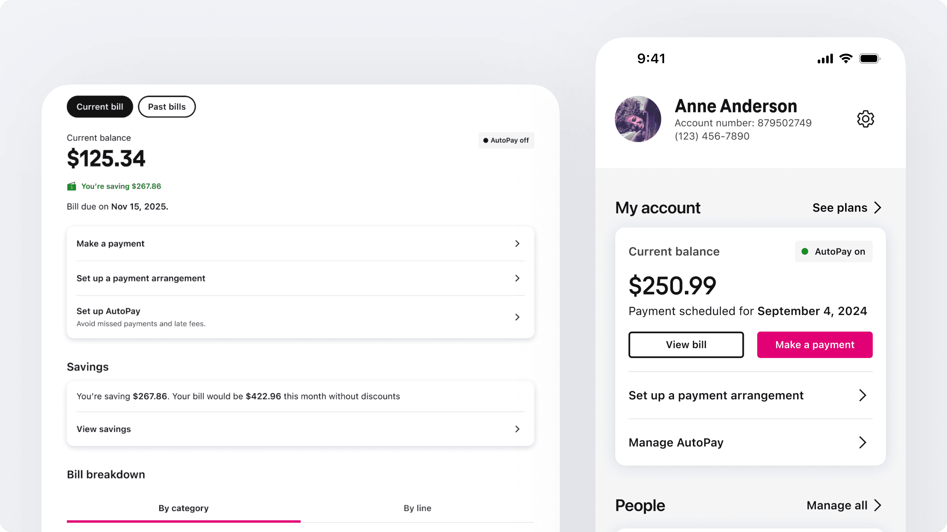
Solution
The new digital bill redefines clarity and control:
A clean, structured overview provides the essentials — balance, due date, and savings — upfront.
Category and line breakdowns make charges intuitive and traceable.
Interactive features like “View Savings” and “AutoPay setup” increase engagement while reducing friction.
A responsive design system ensures consistency across web and app, aligning with T-Mobile’s visual identity and tone.
Results
The redesign delivered measurable impact:
22% reduction in billing-related support calls within six months.
+18% increase in customer satisfaction (CSAT) scores for billing.
Faster comprehension: time to understand total charges dropped by 30%.
Recognised internally as a benchmark UX for enterprise billing within Amdocs’ product suite.
Conclusion
The T-Mobile billing experience continues to evolve, shaped by ongoing insights and collaboration. What began as a redesign has grown into a long-term product foundation — one that helps millions of customers understand their bills with confidence and ease.
